Using Pantone Colors And The Pantone Matching System – Complete Guidance
You often wonder how designers have a deep sense of which color to choose. This is due to the Pantone matching system and its cool color selection.
Now we are going to check about the Pantone matching system in detail. And how designers precisely communicate with these colors.
Table of Contents
Embroidery Digitizing Services
If you are looking for embroidery digitizing services, EMDigitizer is one of the best embroidery digitizing companies. Providing all types of embroidery digitizing Services. I recommend you try digitizing services.
Order NowGet Free QuoteIntroduction Of Pantone Colors and Pantone Matching System:
The renowned color and design company has created a unique set of colors known as Pantone colors. In contrast to standard colors (such as RGB or CMYK) used in screens or printing, these colors remain constant across all devices.
This makes it easier for everyone to correspond precisely to the same color.
A unique serial number is given to every Pantone color. It enables designers to replicate the color exactly.
They can easily coordinate colors between various materials and media. It includes marketing materials, garments, accessories, or packaging goods.
Spot colors can also be specified using Pantone colors. It gives designers the confidence to create stunning designs from a wide range of options.
This system has been accepted widely due to its use on a large scale. They aim for reliability and uniformity when working with color.
Components Of The Pantone Matching System
Here’s what is included in this system:
Color Libraries:
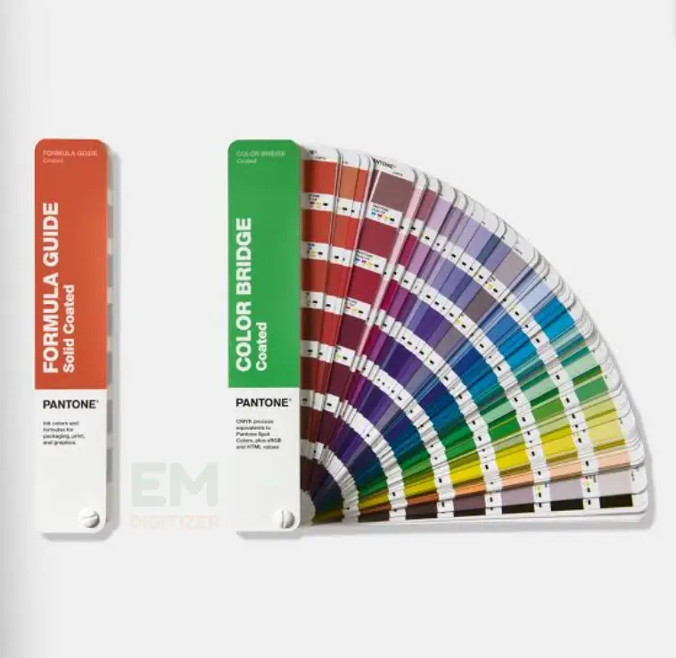
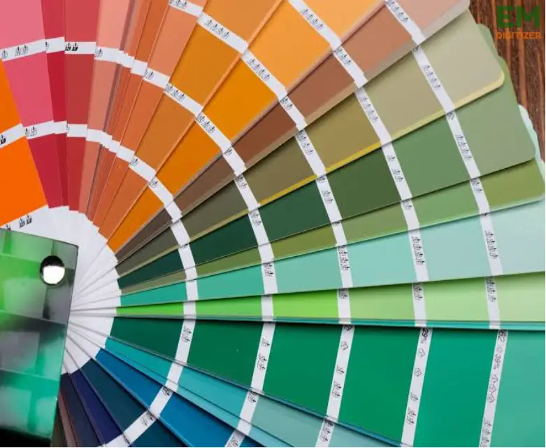
Pantone offers large color libraries with a set of shades in each. These color libraries serve several creators and industries. They offer a wide variety of colors, from bright colors to mild tones.
Spot Colors:
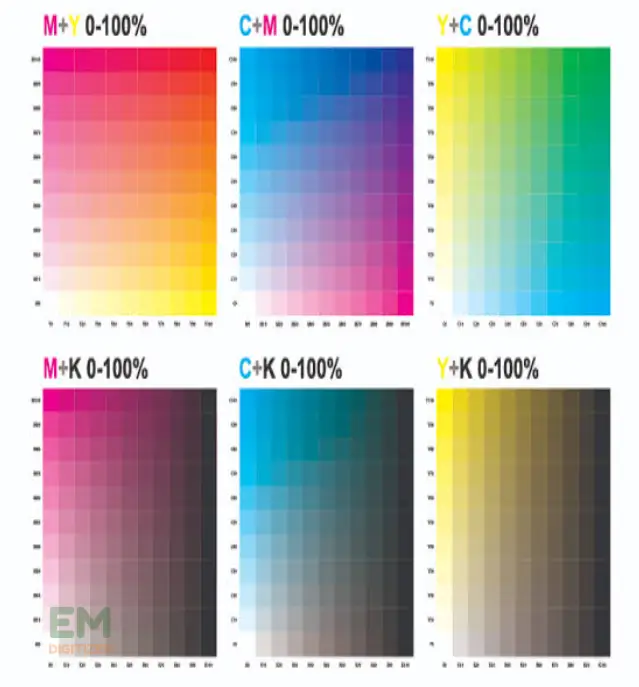
The use of spot colors by PMS is especially well-known. Spot colors are blended inks applied one at a time. It is opposite to the subtractive color processing of the CMYK method.
This process provides uniformity between various printing techniques and materials.
Color Communication:
The PMS codes linked to every color function as a common language for designers. This guarantees that the desired color is reproduced reliably in various materials.
Cross-Media Color Reproduction:
PMS can be used with different types of media. The selected colors will always look the same whether they are used for digital, or other purposes. This flexibility is essential to preserving brand impression on a variety of media.
How To Use Pantone Colors:
To provide a uniform image across a range of design methods, using these is necessary.
- First, choose the Pantone colors you want to use from the vast color palette. You can consider any particular brand or emotional connotations that each shade may have.
- Whether you’re creating digital goods, advertising, or branding, carefully consider how to use these shades in your design.
- Utilize Pantone codes to communicate your color choices clearly with collaborators or manufacturers.
- Keep in mind the intended application. Some Pantone colors are better suited for certain materials or printing processes.
- To ensure accuracy throughout the production process, inspect the colors frequently in drafts and samples.
- When designers recognize their potential for flexibility, their work will appear more skilled and polished.
Tools and Resources for Working with Pantone Colors:
Here I am going to explore the list of resources that designers can use when working with a Pantone matching system.
Color Finder:
It serves as an online database. It allows easy lookup of specific color codes and their digital equivalents.
Use Of Software:
Design software like Adobe Creative Cloud integrates Pantone libraries. It enables accurate color selection within applications like Photoshop and Illustrator.
Color Guides:
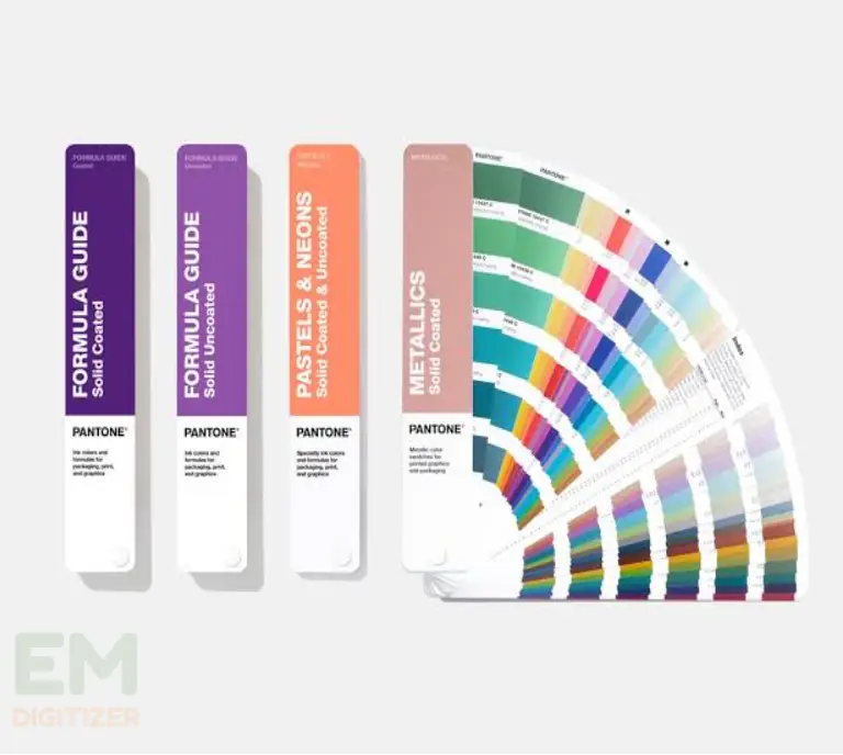
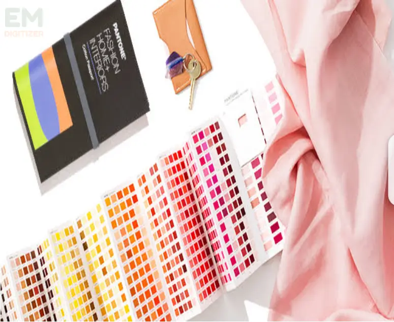
Pantone also offers physical color guides. It provides tangible references for accurate color matching.
Online Color Convertor:
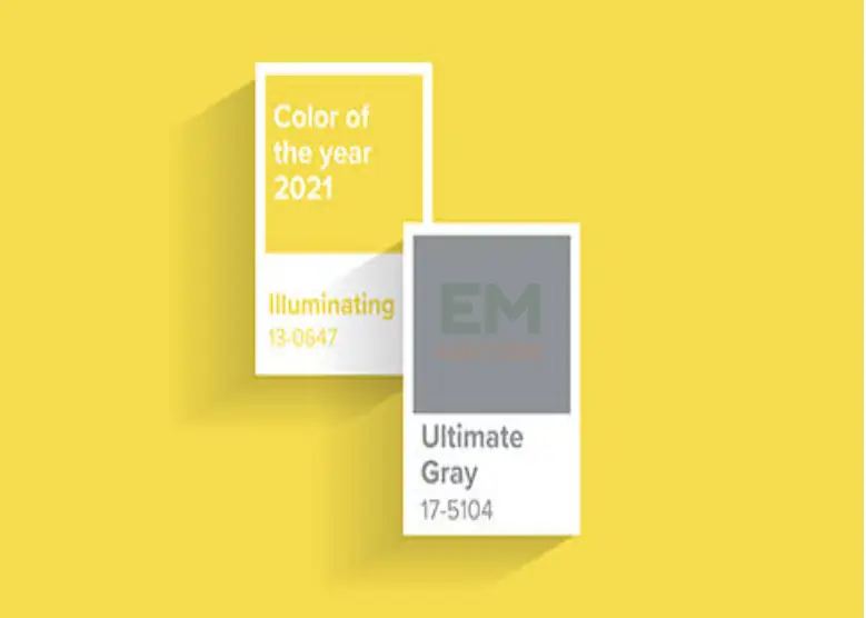
These tools aid in converting Pantone colors into print- or digital-friendly hues. To go with modern designs, it’s critical to stay up to date with Pantone’s official notices, such as the chosen color of the Year.
These tools collectively empower designers to make use of Pantone colors efficiently. It maintains precision in their creative projects.
Applications of the Pantone Matching System:
Web Design:
In web designing, using these colors requires careful planning to maintain consistency and convey their brand identity.
For example, a company with specific colors may incorporate these hues into its website’s color scheme. It ensures a seamless change between online and offline branding.
Designers can use these colors for accent elements such as:
- button
- headers
- or call-to-action elements
They provide a visually appealing and cohesive user experience. Additionally, by employing Pantone’s digital tools, designers can translate Pantone Colors into their RGB. It is for accurate representation on digital screens.
Printing:
Pantone colors provide a standardized tool for dealing with specific shades in the printing industry.
In corporate branding, a company may have specific Pantone colors for its logo. The Pantone matching system guarantees that the logo’s colors remain consistent. Especially when producing:
- business cards
- brochures
- or any printed material
This consistency is essential for building and preserving brand identity. Printers can confidently refer to these color codes. They will achieve the exact shades specified. It results in a professional and cohesive appearance for the printed materials.
Fashion And Textiles:
Pantone colors are very important in the fashion industry. They assist designers in selecting and coordinating fabric colors.
It makes sure that garments have a compatible appearance upon finalization. These colors help designers specify the precise tones they want for apparel.
For instance, a fashion designer creates a clothing line. He may use these colors to establish a uniform palette. He ensures that the chosen colors translate accurately across different materials.
Maintaining a simple style ensures stability for your brand over time and facilitates dealing with suppliers.
Branding:
The Pantone matching system ensures uniformity in color usage across all platforms and facilitates easy brand recognition.
PMS makes sure that these colors are used consistently in a variety of contexts, such as packing, advertisements, and logo creation.
Manufacturers and brand managers can rely on the Pantone Matching System as a useful tool for regular upkeep of:
- color integrity
- enabling a brand to establish a strong consistent presence across various platforms and mediums
- contributing to brand recognition and customer trust.
Quality Control:
PMS is essential to quality control because it allows manufacturers to keep product color constant. And ensures that consumers get exactly what they ordered.
For example, a designer who specifies a Pantone color makes certain the final product has the same shade.
The logo of a business must appear clear across all marketing materials. It highlights how important this accuracy is to preserving reputation.
Designers can ensure that desired colors are precisely replicated by consulting Pantone codes. It reduces the possibility of errors and guarantees a reliable, high-quality outcome.
Conclusion
It is easier for brands to use colors consistently when they are aware of the Pantone Matching System. This helps them acknowledge their work.
Pantone colors offer you a wide range of creative possibilities. It includes creating a logo, packaging, or advertisement. Simply make effective use of color and follow proper guidance to make your creations alive and accurate.
This reliable color-matching system makes certain that clients are communicating precisely. For precise color reproduction, it is essential.
Pantone releases fresh palettes and fashion trends regularly. Keeping up with their releases is a good idea. Particularly if you want to use the newest color patterns in your projects.
Pantone’s colors can be utilized in digital design to preserve integrity across online and offline branding.
In these situations, printers can use a combination of standard inks to produce the closest match. It takes communication between you and the printer to get the right color results.
If you have any questions leave the comments or you can visit our social channels for more updates regularly. We provide embroidery digitizing services if you need digitizing services feel free to contact us or email us.
